Meta Covid-19 Map
Designing a real-time mapping and data visualization tool to help global communities track, understand, and respond to the Covid-19 pandemic — under extreme time pressure.
Designing in a Crisis
In early 2020, as Covid-19 began spreading globally, there was an enormous public need for clear, accurate, real-time information. Meta had an opportunity to help — with reach across billions of users and a platform built for sharing and connecting communities.
Crisis design is design under different rules. Speed matters. Clarity matters even more — in a public health context, a misleading visualization isn't just a UX problem, it's a potential public harm. And at Meta's scale, anything we shipped would reach hundreds of millions of people.
My Role
Lead designer on the Covid-19 Map — owning the end-to-end experience from initial concept through launch. I worked closely with another designer, engineers, data scientists, and public health partners to translate complex, constantly-changing data into something people could actually understand and act on.
Information Without Clarity
Data about the pandemic was everywhere. The problem wasn't access — it was comprehension. Most available tools were built for researchers and public health professionals, not for a general audience trying to understand the risk in their city or make decisions about their families.
Key User Needs
- Understand the current state of Covid-19 in their local area, not just globally
- Track changes over time to understand whether things were getting better or worse
- Find reliable information without having to evaluate source credibility themselves
Design Constraints
- Data was inconsistent across regions — different countries and states tracked and reported differently
- The situation was changing rapidly — the tool needed to update in real time
- Had to serve users across a wide range of data literacy levels and device types
The Core Design Question
How do we present complex, uncertain, real-time data in a way that informs without misleading — and empowers people to act rather than panic?
Design Principles for Crisis
Before designing anything, I established a set of principles to guide decisions under pressure. In a fast-moving environment, principles do the work that process can't — they give you a way to cut through ambiguity quickly.
Show people what they need to make decisions, not everything we have. An overwhelming dashboard is worse than a focused one.
Most people care about what's happening near them first. Lead with the local, let the global be the context.
Show sources. Show limitations. Don't hide uncertainty — design for it. Users are more forgiving of imperfect data than of feeling misled.
Key Design Decisions
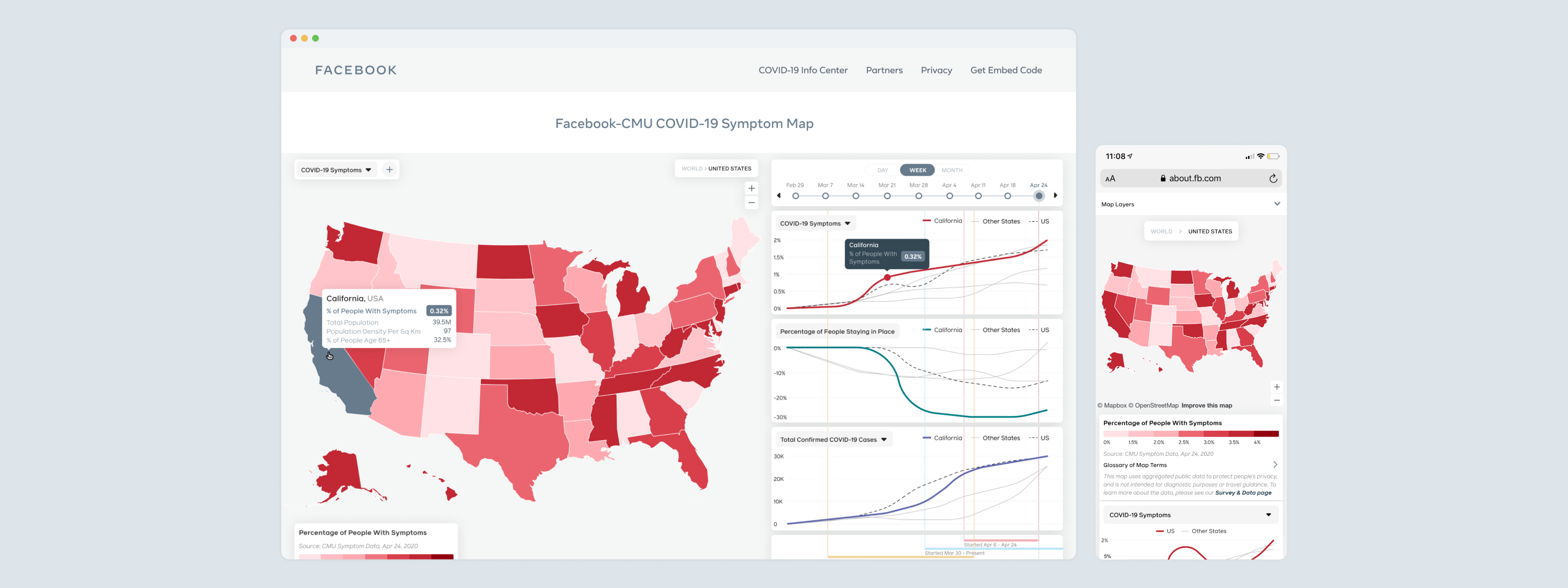
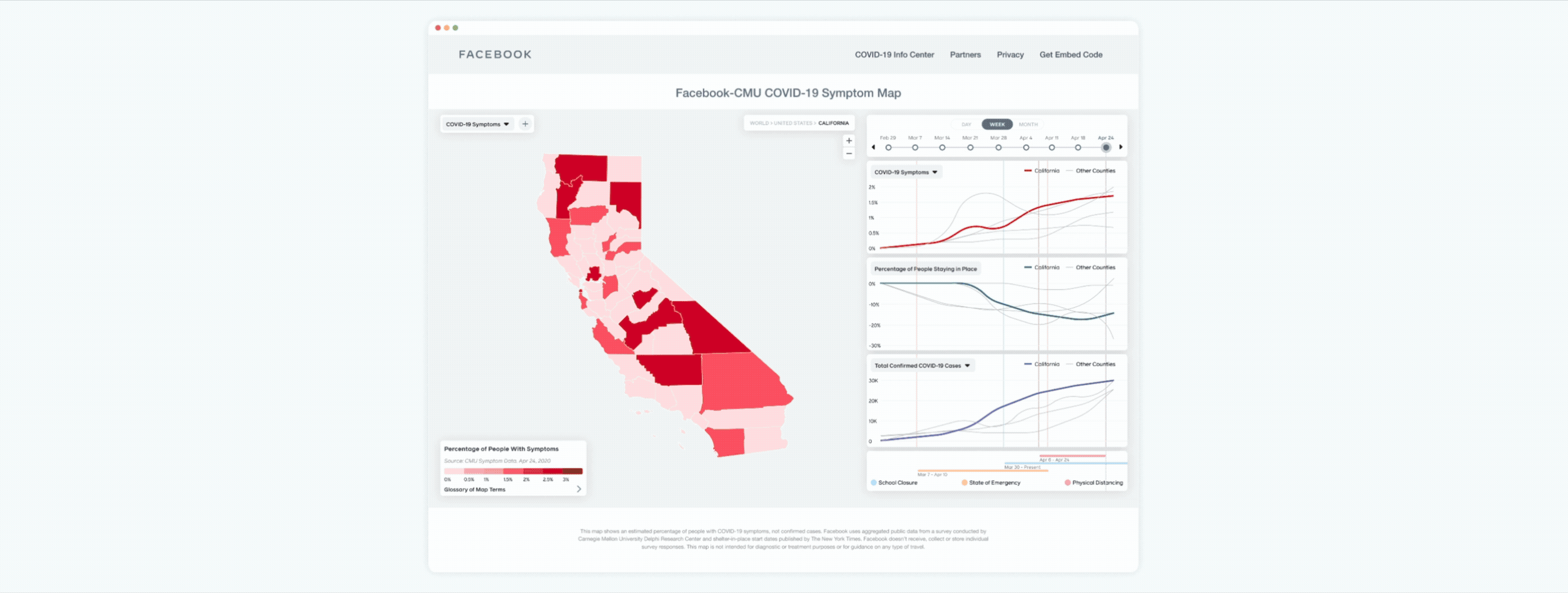
The Map as Primary Interface
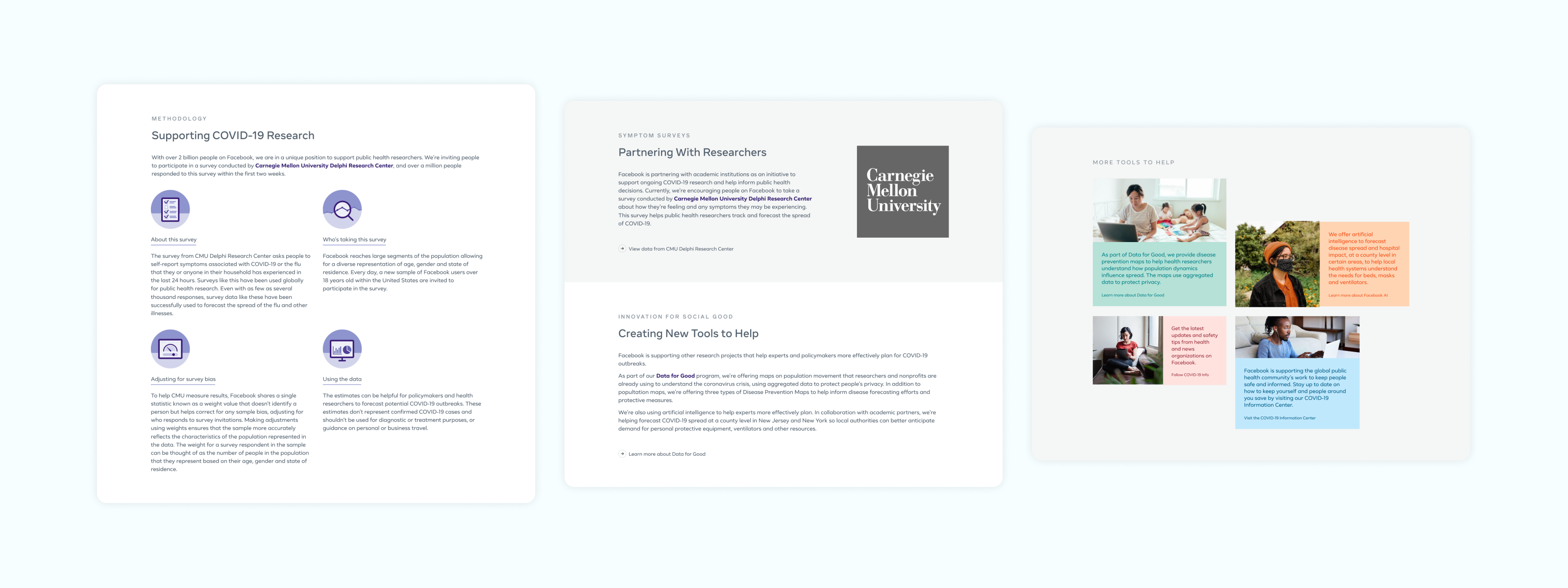
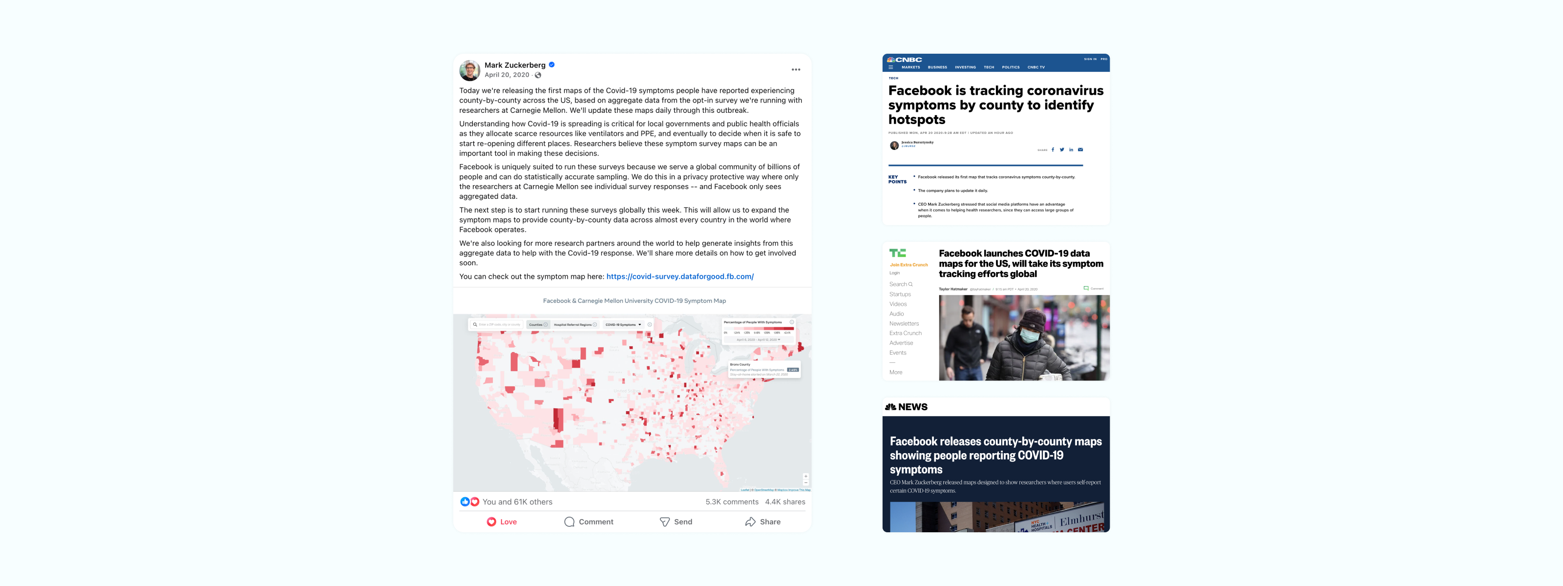
Maps are intuitive for geographic data, but they come with well-documented visualization pitfalls — large low-density areas visually dominate, raw counts mislead without population context. I worked closely with data scientists to find representations that were both accurate and readable for a general audience: normalized rates rather than raw counts, trend indicators that showed trajectory rather than just magnitude.
Progressive Detail
The experience was designed around progressive disclosure. The top level gave a clear global picture. Tapping into a region surfaced local context. Tapping further gave access to the detailed data for users who wanted it. This let us serve casual users and informed ones with the same interface.
Communicating Uncertainty
Data about the pandemic was never perfectly reliable — testing rates varied, reporting lagged, definitions changed. Rather than presenting data as authoritative fact, we designed to communicate confidence levels and data freshness directly in the UI. This was a deliberate tradeoff: it made the interface more complex, but it made the tool more trustworthy.
Shipping Under Pressure
The timeline from kick-off to launch was measured in weeks, not months. I ran daily syncs with engineering during the build phase to catch misalignments early and make real-time scope calls.
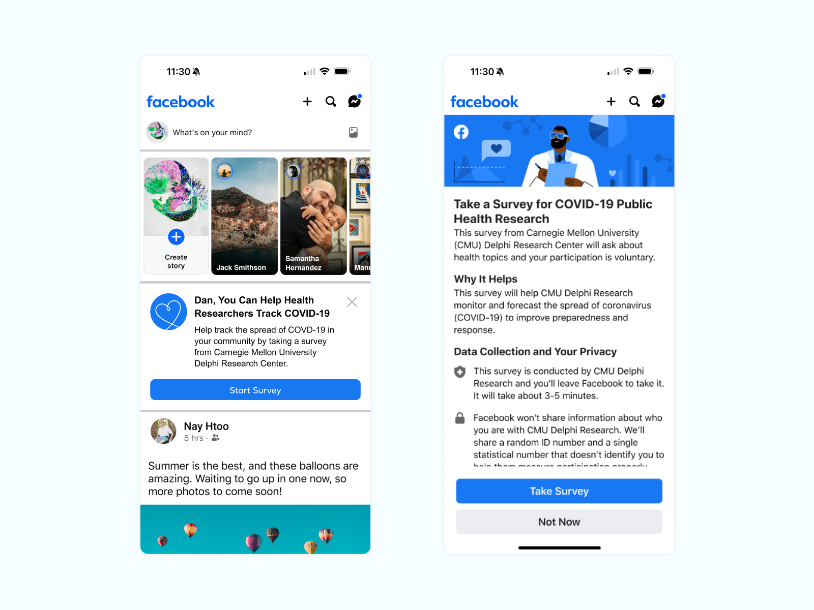
Working With Public Health Partners
We worked with external public health organizations to validate that our data representations were accurate and wouldn't mislead. What we learned shaped the final design in meaningful ways — particularly around communicating confidence intervals and data sourcing.
Designing Within the Facebook Brand
The Covid-19 Map launched under the Facebook brand — at the time actively refreshing its visual identity. Approvals moved quickly because I kept brand embedded in the process early, rather than treating it as a final-step review.
What Launched
The Covid-19 Map launched on Facebook in 2020, providing real-time case data, trend visualization, and local context to users globally.
What I'd Do Differently
Crisis design taught me that speed is a design constraint, not an excuse. I'd also prioritize designing for iteration more explicitly from the start — building in the infrastructure to update, refine, and respond as the situation evolved.
Not much tests a designer's judgment like shipping something important, fast, at massive scale, with imperfect information. The Covid-19 Map was that test — and it changed how I think about design quality, responsibility, and speed.
"I designed this tool at a moment when billions of people were scared and looking for information they could trust. That responsibility doesn't leave you. It's why I take data visualization seriously, and why I hold a high bar for clarity in every product I work on."